
KSEEB Class 8 Maths Solutions For Chapter 12 Introduction Of Graphs Points To Remember
Graphical representation of data is easier to understand.
1) A bar graph is used to show comparison among categories.
2) A pie graph is used to compare parts of a whole.
3) A Histogram is a bar graph that shows data in intervals.
A line graph displays data that changes continuously over periods of time.
A line graph which is a whole unbroken line is called a linear graph.
Read and Learn More KSEEB Solutions for Class 8 Maths
For fixing a point on the graph sheet we need, x – co-ordinate and y – co-ordinate
The relation between dependent variable and independent variable is shown through a graph.
A bar graph: A pictorial representation of numerical data in the form of bars (rectangles) of uniform width with equal spacing. The length (or height) of each bar represents the given number.
A pie graph: A pie graph is used to compare parts of a whole. The various observations or components are represented by the sectors of the circle.
| Class 10 Science | Class 11 Chemistry |
| Class 11 Chemistry | Transformation of Sentences |
| Class 8 Maths | Class 8 Science |
A Histogram: Histogram is a type of a bar diagram, where the class intervals are shown on the horizontal axis and the heights of the bars (rectangles) show the frequency of the class interval, but there is no gap between the bars as there is no gap between the class intervals.
Linear graph: A line graph in which all the line segments form a part of a single line.
Coordinates: A point in cartesian plane is represented by an ordered pair of numbers.
Ordered pair: A pair of numbers written in specified order.

Kseeb Solutions For Class 8 Maths Chapter 12 Pdf
Introduction To Graphs Solutions KSEEB Class 8 Maths Introduction To Graphs Exercise 12.1
1. The following graph shows the temperature of a patient in a hospital, recorded every hour.
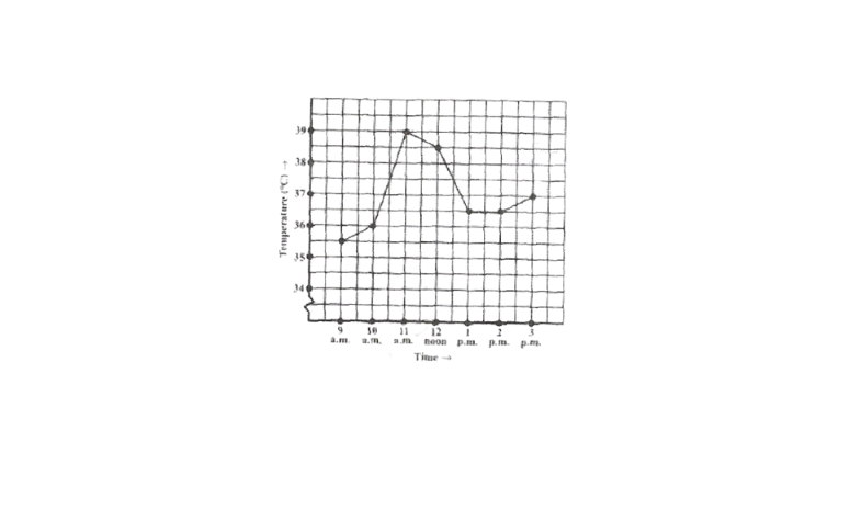
a)What was the patient’s temperature at 1 p.m.?
b)When was the patient’s temperature 38.5°c?
c)The patient’s temperature was the same two times during the period given. What were these two times?
d)What was the temperature at 1.30 p.m.? How did you arrive at your answer?
e)During which periods did the patient’s temperature showed an upward trend?
Solution: a)At 1 p.m., the patient’s temperature was 36.5°c.
b)The patient’s temperature was 38.5°c at 12 noon.
c)The patient’s temperature was the same at 1 pm and 2 pm.
d)The graph between the times 1 pm and 2 p.m. is parallel to the x-axis. The temperature at 1 pm and 2pm is 36.5°c. So the temperature at 1.30pm is 36.5°c.
e)During the following periods, the patient’s temperature showed an upward trend.
9 am to 10 am, 10 am to 11am,
2 pm to 3 pm
Karnataka Board 8th Maths Chapter 12 Introduction To Graphs Solutions
2. The following line graph shows the yearly sales figures for a manufacturing company.
a)What were the sales in
1) 2002
2) 2006?
b)What were the sales in
1) 2003
2) 2005?
c)Compute the difference between the sales in 2002 and 2006.
d)In which year was there the greatest difference between the sales as compared to its previous year?
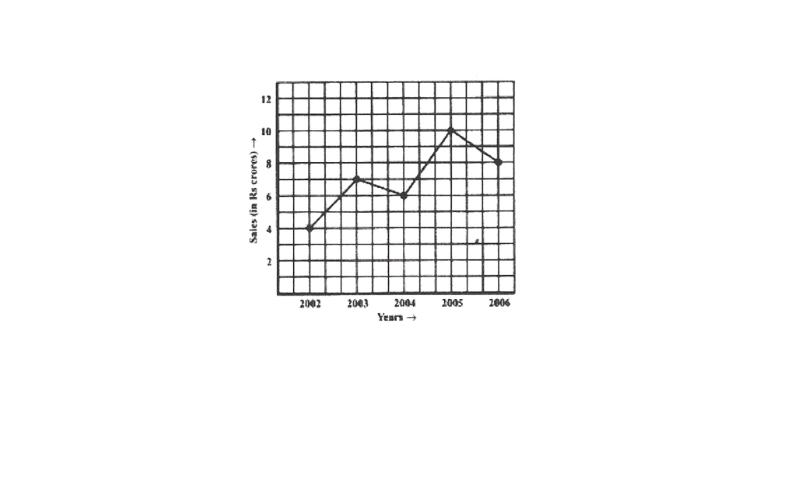
Solution: a) 1) In 2002, the sales were ₹4 crores.
2)In 2006, the sales were ₹8 crores.
b)1) In 2003, the sales were ₹7 crores.
2)In 2005, the sales were ₹10 crores.
c)In 2002, the sales were ₹4 crores and in 2006, the sales were ?8 crores.
Difference between the sales in 2002 and 2006 = ₹(8 – 4) crores = ₹4 crores.
d)Difference between the sales of the year 2006 and 2005 = ₹(10 – 8) = ₹2 crores.
Difference between the sales of the year 2005 and 2004 = ₹(10 – 6) = ₹4 crores.
Difference between the sales of the year 2004 and 2003 = ₹(7 – 6) = ₹1 crores.
Difference between the sales of the year 2003 and 2002 = ₹(7 – 4) = ₹3 crores
Hence, the difference was the maximum in the year 2005 as compared to its previous year 2004.
Practice Questions For Introduction To Graphs KSEEB Maths
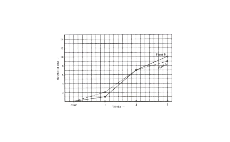
3. For an experiment in Botany, two different plants, plant A and plant B were grown under
similar laboratory conditions. Their heights were measured at the end of each week for 3 weeks, the results are shown by the following graph.
a)How high was plant A after
1)2 week
2) 3 weeks?
b)How high was plant B after
1) 2 weeks
2) 3 weeks?
c)How much did plant A grow during the 3rd week?
d)How much did plant B grow from the end of the 2nd week to the end of the 3rd week?
e)During which week did plant A grow most?
f)During which week did plant B grow least?
g)were the two plants of the same height during any week shown here? specify.
Kseeb 8th Standard Maths Chapter 12 Textbook Solutions
Solution: a) 1) After 2 weeks, the height of plant A was 7cm.
2)After 3 weeks, the height of plant A was 9 cm
b)1) After 2 weeks, the height of plant B was 7 cm.
2) After 3 weeks, the height of plant B was 10cm.
c)Growth of plant A during 3rd week = 9 cm – 7cm = 2 cm
d)Growth of plant B from the end of the 2nd week to the end of the 3rd week
= 10cm – 7cm = 3cm
e)Growth of plant A during 1 st week = 2cm – 0 cm = 2cm
Growth of plant A during 2nd week = 7cm – 2cm = 5 cm Growth of plant A during 3rd week = 9cm – 7cm = 2 cm
∴ Plant A grew the most i.e., 5 cm during the 2nd week.
f)Growth of plant B during 1st week = 1cm – 0 cm = 1cm
Growth of plant B during 2nd week
= 7cm- lcm = 6cm
Growth of plant B during 3rd week
= 10cm- 7cm = 3 cm
Plant B grew the most i.e., 6 cm during the 2nd week.
g)At the end of the 2nd week, the heights of both plants were same.
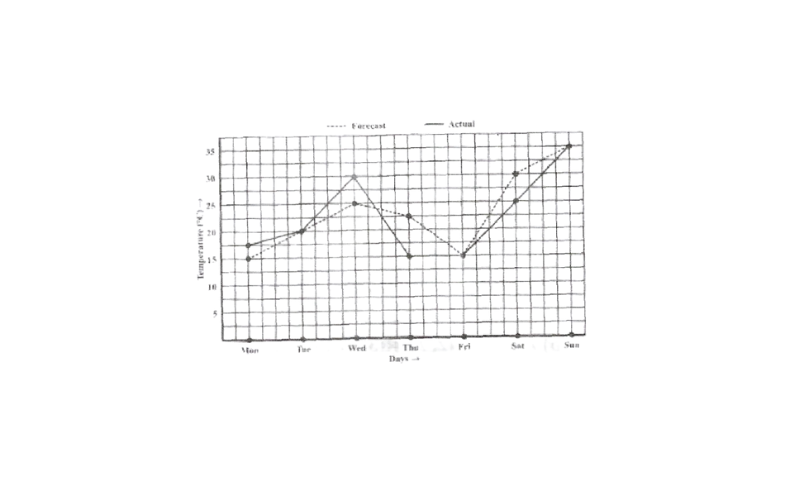
4. The following graph shows the temperature forecast and the actual temperature for each day of a week.
a) On which days was the forecast temperature the same as the actual temperature?
b) What was the maximum forecast temperature during the week?
c) What was the minimum actual temperature during the week?
d) On which day did the actual temperature differ the most from the forecast temperature?
Class 8 Maths Chapter 12 Kseeb Important Questions And Answers
Solution: a) The forecast temperature was same as the actual temperature on Tuesday, Friday and Sunday.
b) The maximum forecast temperature during the week was 35°c.
c) The minimum actual temperature during the week was 15°c.
d) The actual temperature differs the most from the forecast temperature on thursday.
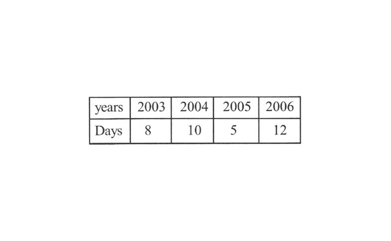
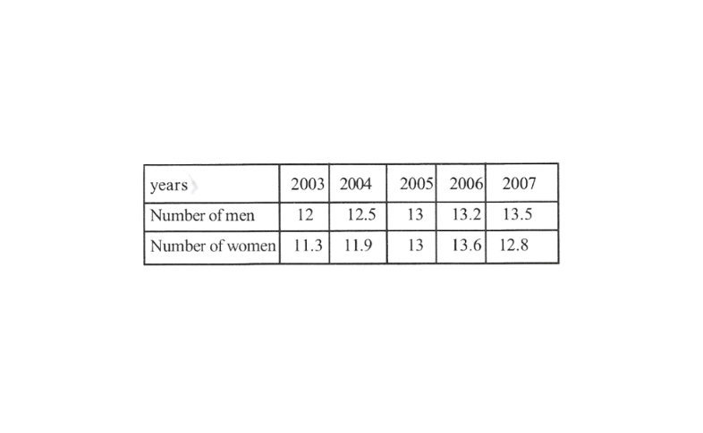
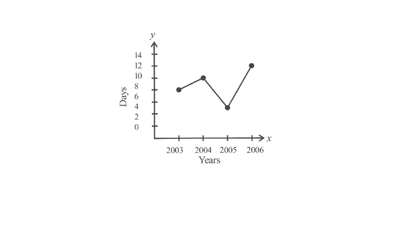
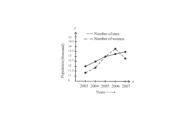
5. Use the tables below the draw linear graphs.
a) The number of days a hill side city received snow in different years.
b) Population (in thousands) of men and women in a village in different years.
Introduction To Graphs Class 8 Kseeb Notes Pdf
Solution: a) By taking the years on x- axis and the number of days on the y-axis and taking scale as 1 unit = 2 days only – the axis and 2 unit = 1 year on x-axis, the linear graph of the given information can be drawn as follows.
b)By taking the years on x – axis and population on y- the axis and scale as 1 unit = 0.5 thousand on the y-axis and 2 unit = 1 year on x-axis, the linear graph of the given information can be drawn as follows.
KSEEB Class 8 Maths Chapter 12 Solved Problems
6. A courier – a person cycles from a town to a neighboring suburban area to deliver a parcel to a merchant. This distance from the town at different times is shown by the following graph.
a)What is the scale taken for the time axis?
b)How much time did the person take for the travel?
c)How far is the place of the merchant from the town?
d)Did the person stop on his way? Explain.
e)During which period did he ride fastest?
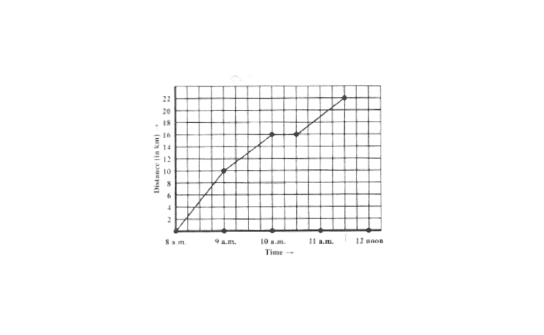
Solution: a) Scale taken for the time axis is 4 units = 1 hour.
b) The person traveled during the time 8 am. – 11.30 am.
∴ The person took 3 1/2 hours to travel
c)The merchant is 22 km far from the town.
d)Yes, the person stopped on his way from 10 am to 10.30 am. This is indicated by the horizontal part of the graph.
e)from the graph, it can be observed that during 8 am to 9 am, The person travelled the maximum distance. Thus, the person’s ride was the fastest between 8 am and 9 am.
7. Can there be a time-temperature graph as follows? Justify your answer.
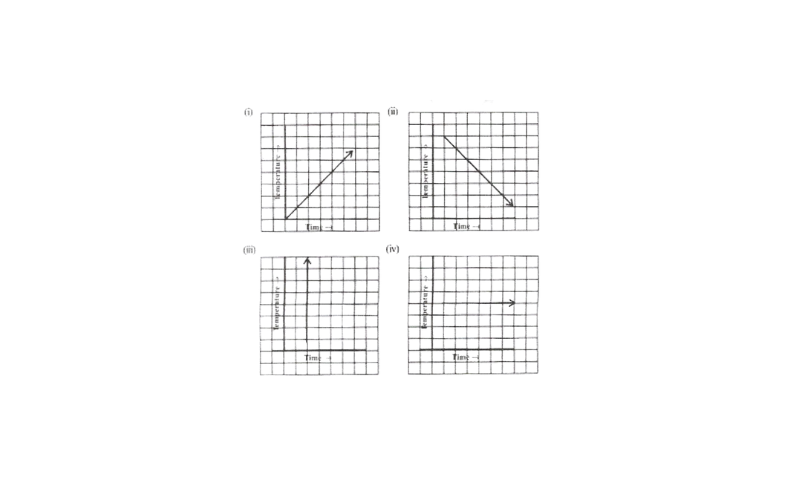
Solution: 1) This can be a time-temperature graph, as the temperature can increase with the increase in time.
2)This can be a time-temperature graph, as the temperature can decrease with the decrease in time.
3)This cannot be a time-temperature graph since different temperatures at the same time are not possible.
4)This can be a time-temperature graph, as same temperature at different times is possible.
KSEEB Maths Class 8 Introduction To Graphs Exercise 12.2
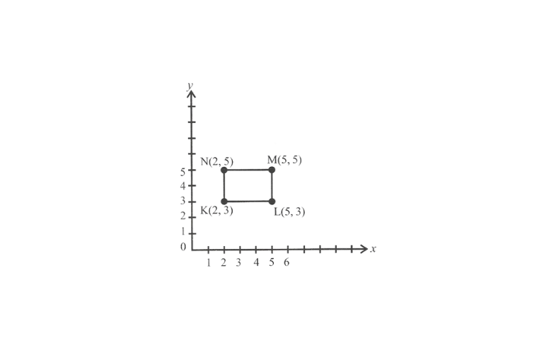
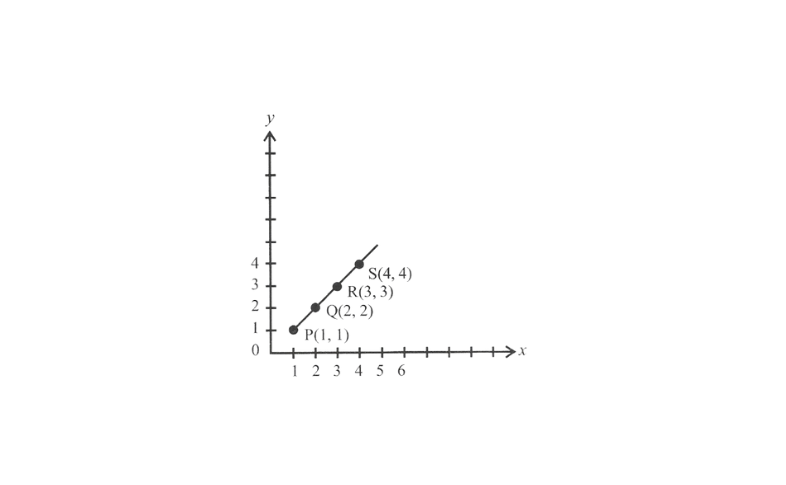
1. Plot the following points on a graph sheet verify if they lie on a line.
a)A(4, 0), B(4, 2), C(4, 6), D(4, 2.5)
b)P(l, 1),Q(2,2),R(3,3),S(4,4)
c)K(2, 3), L(5,3), M(5,5), N(2,5)
Solution:
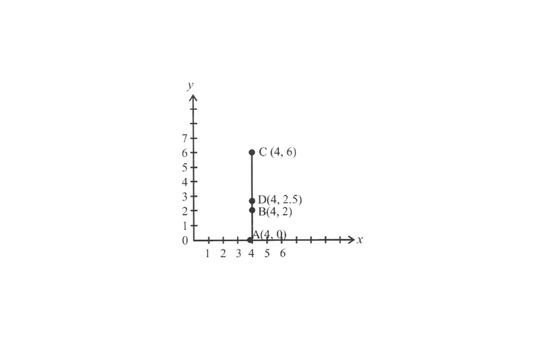
a)From the graph, it can be observed that the points A, B, C and D lie on the same line.
b)Hence, points P, Q, R & S lie on the same line.
c)Hence, points K, L, M & N are not lying on the same line.
2. Draw the line passing through (2,3) and (3, 2). Find the co-ordinates of the points at which this line meets the x – axis and y -axis.
Solution:
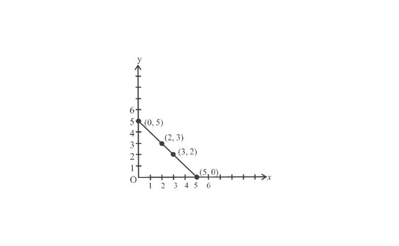
From the graph, it can be observed that the line joining the points (2, 3) and (3, 2) meet the x – axis at the point x(5, 0) and the y – axis at the point (0, 5).
3. Write the co-ordinates of the vertices of each of these adjoining figures.
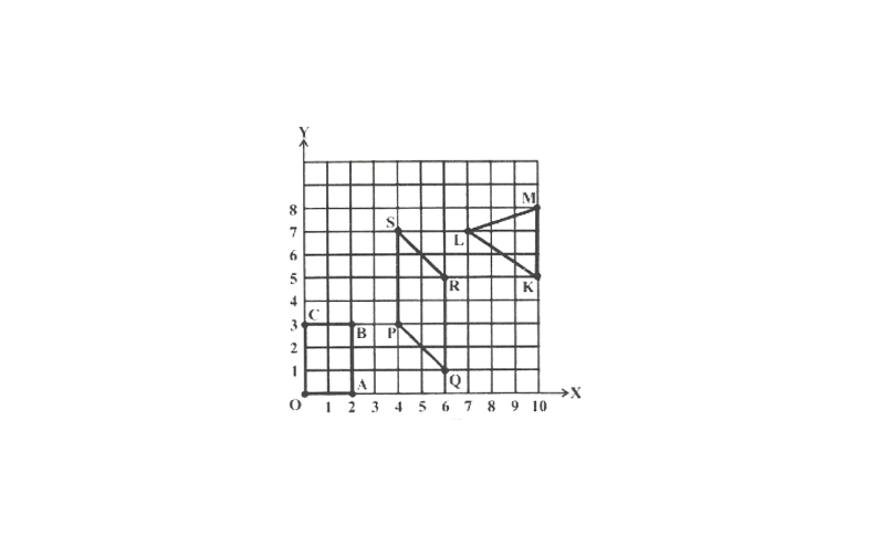
Solution: The co-ordinates of the vertices in the given figure are as follows.
0(0,0)
A(2, 0)
B(2, 3)
C(0, 3)
P(4,3)
Q(6, 1)
R(6, 5)
S(4, 7)
K(10, 5)
L(7, 7)
M(10, 8)
4. State whether True or False. Correct that are false.
1)A point whose x – co-ordinate is zero and y – co-ordinate is non-zero will lie on the y -axis.
Solution: True
2) A point whose y – co-ordinate is zero and x – co-ordinate is 5 will lie on y -axis.
Solution: False
The point whose y – co-ordinate is zero and x – co-ordinate is 5 will lie on x – axis.
3)The co-ordinates of the origin are (0,0)
Solution: True
Introduction To Graphs Exercise 12.3
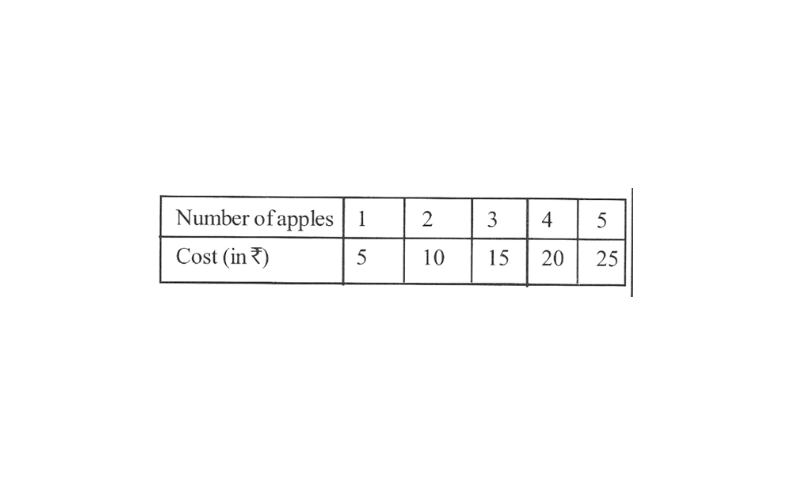
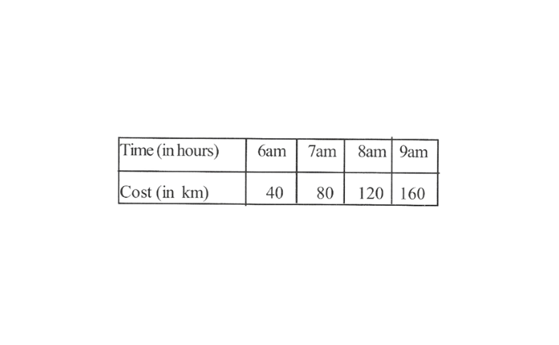
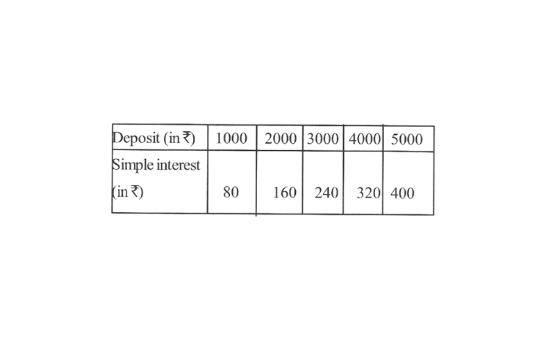
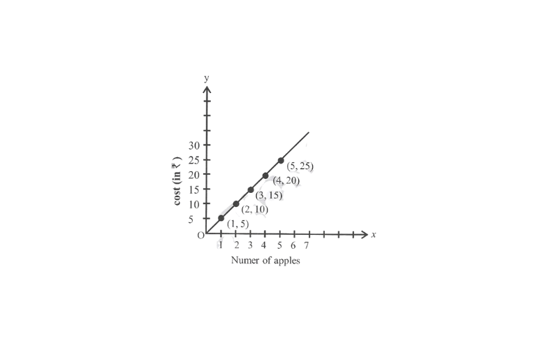
1. Draw the graphs for the following tables of values, with suitable scales on the axes
a) cost of apples
b) Distance traveled by a car
1)How much distance did the car cover during the period 7.30 a.m to 8 a.m.?
2)What was the time when the car had covered a distance of 100 km since it’s start?
c) Interest on deposit for a year.
Karnataka Board Class 8 Maths Introduction To Graphs Problems And Answers
1)Does the graph pass through the origin?
2)Use the graph to find the interest on ₹2500 for a year.
3)To get an interest of ₹280 per year, how much money should be deposited?
Solution: a) Taking a suitable scale for x-axis 1 unit = 1 apple and for the y-axis, 1 unit = ₹5), we can mark the number of apples on the x-axis and the cost of apples on the y-axis, A graph of the given data is as follows.
b) Taking a suitable scale (for the x-axis, 2 units = 1 hour and for the y-axis, 2 units = 40km) we can represent the time on the x-axis and the distance covered by the car on the y-axis. A graph of the given data is as follows.
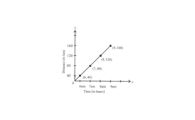
1)During the period 7.30a.m to 8 a.m. The car covered a distance of 20 km.
2)The car covered a distance of 100km at 7.30 am. Since its start.
c) Taking a suitable scale
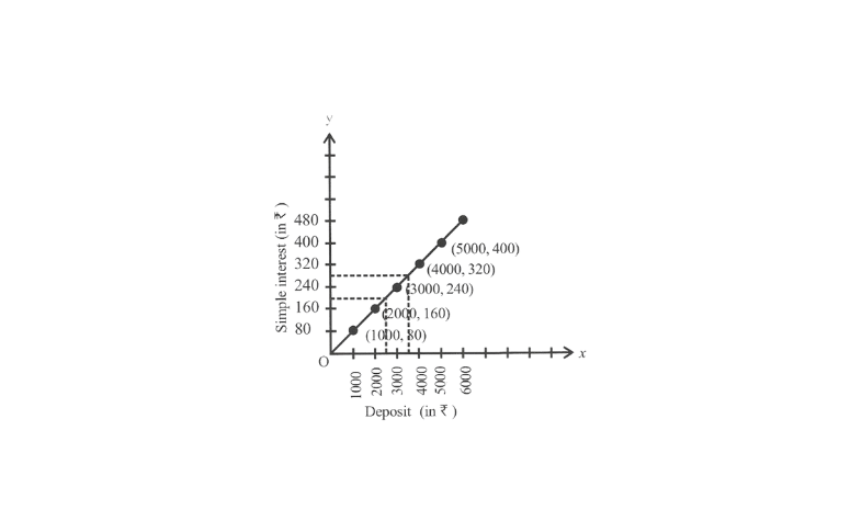
For x -axis, 1 unit = X1000 and for y – axis 1 unit = ₹80. We can represent the deposit on x – axis and the interest earned on that deposit on y – axis. A graph of the given data is obtained as follows.
From the graph, the following points can be observed.
1)Yes, the graph passes through the origin.
2)The interest earned in a year on a deposit of ₹2500 is ₹200.
3)To get an interest of ₹280 per year, ₹3500 should be deposited.
2. Draw a graph for the following.
1) is it a linear graph?
How To Solve Graph Problems In Class 8 Kseeb Maths
2) is it a linear graph?
Solution: 1) choosing a suitable scale,
For x – axis, 1 unit = 1cm, and for y – axis, 1 unit = 4cm. We can represent the side of a square on x – axis and the perimeter of that square on y – axis. A graph of the given data is drawn as follows.
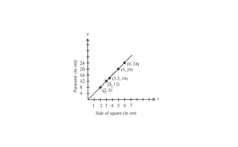
It is a linear graph.
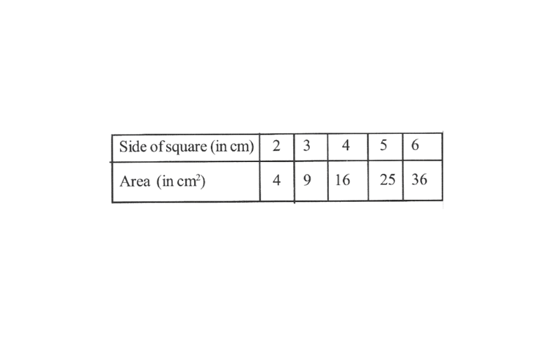
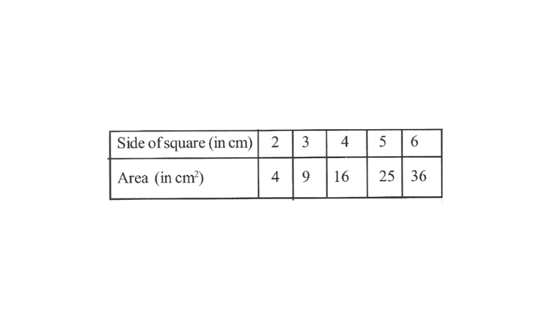
2)Choosing a suitable scale
For x – axis, 1 unit = 1 cm and for y – axis 1 unit = \(4cm^2\). We can represent the side of a square on the x-axis and the area of that square on y – axis. A graph of the given data is as follows.
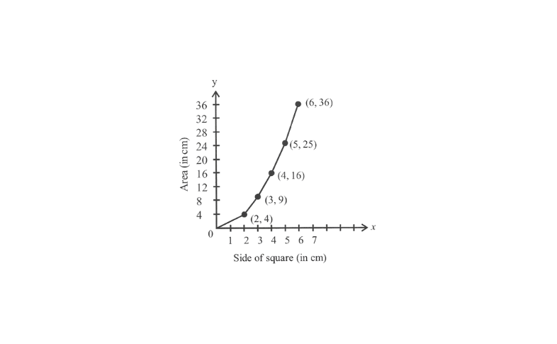
Kseeb 8th Maths Chapter 12 Exercise Solutions Step By Step
It is not a linear graph.
KSEEB Class 8 Maths Introduction To Graphs Additional Problems
1. The point (4, -3) lies in which quadrant?
Solution: The point (4, -3) lies in 4 quadrant.
2. Write the x-co-ordinate (abscissa) of each of the given points :
1) (3,7)
2) (7,5)
Solution: We know the point on graph is denoted by (x,y), and x – co – ordinate is abscissa.
point (1) (3,7), 3 is the x-co-ordinate
(2)(7,5), 7 is the x-co-ordinate
3. Write the y – co – ordinate (ordinate) of each of the given points,
1) (3,5)
2) (5,0)
Solution: (1) point (3, 5), 5 is the y – co – ordinate
(2) (5, 0), 0 is the y – co – ordinate
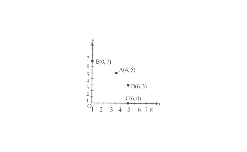
4. Plot the following points on graph paper.
a) A(4,5) b) (0,7) c) C(6, 0) d) D(6,3)
Solution:
5. Write the co-ordinates of all the points in the given graph.
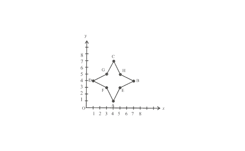
Solution:
A(4, 1) E(5,3)
B(7,4)F(3,5)
C(4, 7) G(3, 5)
D(l, 4) H(5, 5)
6. Plot the points (4, 4), (1, 3), (4, 2), and (7,3) on a paper and connect them with line segments. Name the shape formed by these points.
Solution:
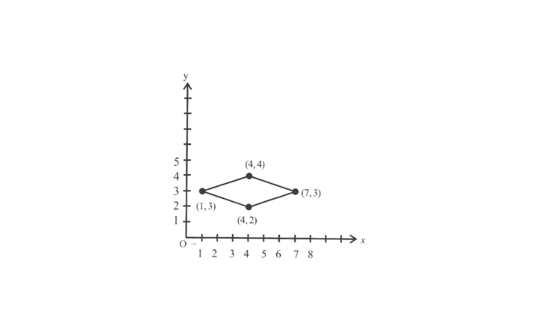
The shape formed is a rhombus.
7. Study the given map of a zoo and answer the following questions.
1)Give the location of lions in the zoo
2)(D, f) and (C, d) represent location of which animals in the zoo?
3)where are the toilets located?
4)Give the location of canteen
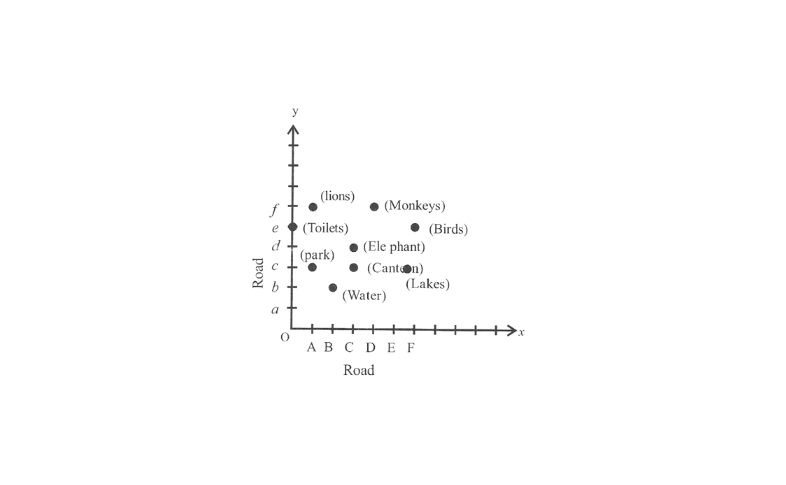
Solution:
1) (A, f)
2)By seeing through graph, point (D, f) represents monkeys point (C, d) represent elephants
3)(0, e)
4)(C,c)
8. The following graph shows the journey made by two cyclists, one from A to B and the other from town B to A.
1)At what time did cyclist II rest? How long did the cyclist rest?
2)Was cyclist n cyclind faster or slower after the rest?
3)At what time did the two cyclists meet?
4)How far had cyclist II travelled when he met cyclist I?
Solution:
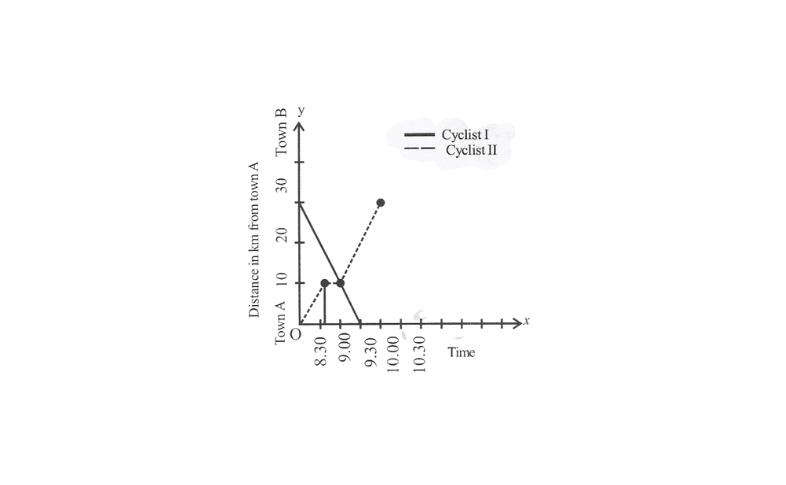
Solution: 1) Cyclist II rest for 15 minute from 8 :45 am to 9:00am
2)Cyclist II was cycling faster after the rest.
3)Two cyclist meet at 9 : 00 am.
4)cyclist II travelled 10 km when he met cyclist I.
9. Draw a graph for the radius and circumference of circle using a suitable scale.
(Hint: Take radius 7,14,21 units and so on)
From the graph,
1) Find the circumference of the circle when radius is 42 units.
2) At what radius will the circumference of the circle be 220 units?
Solution:
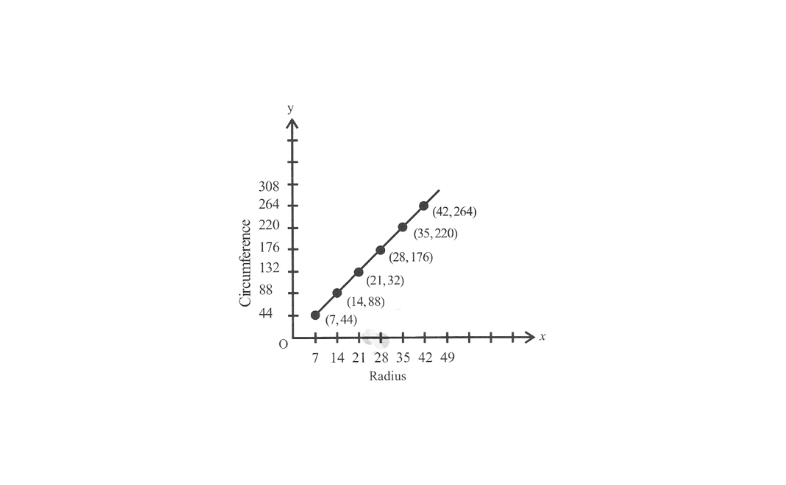
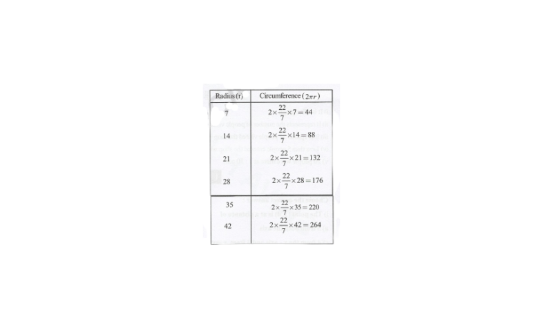
1)When radius is 42 units, circumference is 264 units
2)When circumference of the circle is 220 units, radius is 35 units.
10. The following graph shows the number of people present at a certain shop at different times. Observe the graph and answer the following questions.
1)What type of graph of this?
2)What information does the graph give?
3)What is busiest time of day at the shop?
4)How many people enter the shop when it open
5)About how many people are there in the shop at 1: 30 pm?
Solution:
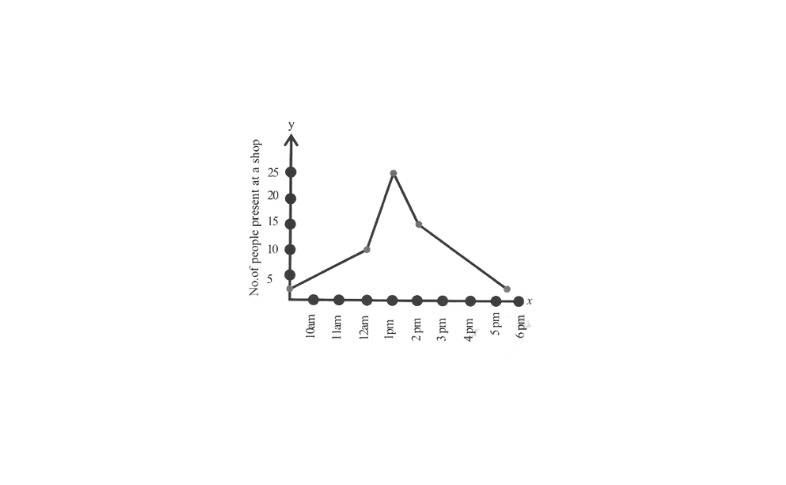
1)It is a line graph
2)It represents the number of people visited the shop at different time.
3)It is 1 pm as 25 people visited the shop which is maximum.
4)Less than 5 people entered the shop when it opened.
5)20 people were there at 1: 30 p.m.